How to use the stakeholder mapping template
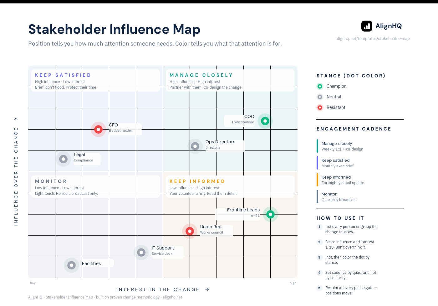
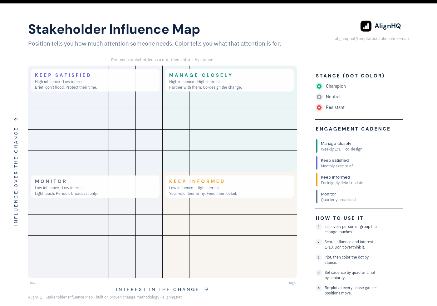
This stakeholder mapping template plots every stakeholder on two axes — influence over the change, and interest in it — then colors each one by where they currently stand. Three pieces of information in one picture, and the value isn't the grid. It's the cadence each quadrant tells you to run.
The two axes, and the third variable
Influence over the change (vertical) — not seniority. Influence is whether this person's opinion changes other people's behavior. A respected team lead often outranks a director here, and mapping by org chart is how change teams miss the person who actually decides.
Interest in the change (horizontal) — how much they care about the outcome. High influence with low interest is the most dangerous combination on the grid: they can stop this and they aren't paying attention, so the first time they engage is when something has already gone wrong.
Stance, as the color of the dot — champion, neutral, resistant. Where they are today, not where you need them. Recording aspiration instead of reality is the most common way this template gets filled in uselessly.
Position tells you how much attention someone needs. Color tells you what that attention is for.
Name five people, not fifty
The sponsor, the leader most likely to slow it down, your most convinced champion, and two middle managers whose teams are affected. A five-name map you keep current beats a forty-name map you filled in once.
Place them honestly, including the awkward one
Naming a resistant senior leader isn't disloyal, it's planning. If you can't write it down you can't plan around it, and you'll end up managing it in a corridor conversation two weeks before go-live.
Set cadence by quadrant, not by seniority
This is the step that makes the map do work instead of describe a situation. Each quadrant gets a standing rhythm — see the four below.
Write one action per name
A map without actions is a diagram. For each person: what do we need from them, who owns the relationship, and what's the next specific conversation.
Re-plot at every phase gate
Three questions per name: has their influence or interest changed, has their stance moved and why, what do we owe them next. Twenty minutes. Stakeholder position is live data, not an artifact you file at kickoff.
What the four quadrants actually mean
Then read the colors. Two patterns are worth naming. A champion sitting alone in “manage closely” with everyone else neutral means you don't have executive backing, you have one calendar entry — single-sponsor changes fail the moment that person is reorganized, promoted, or simply gets busy, and one of those three always happens. And a champion parked in “keep informed” is unused capacity, which is the cheapest thing on this page to fix.
High influence · high interest
Weekly 1:1 plus co-design. Partner with them. These people should be shaping the change, not receiving it.
High influence · low interest
Monthly exec brief. Brief, don't flood. They can stop this and they're not watching, so protect their time and make every contact count. A resistant dot here is your single biggest risk on the page.
Low influence · high interest
Fortnightly detail update. This is your volunteer army. Feed them detail; they'll carry it further than any comms plan.
Low influence · low interest
Quarterly broadcast. Light touch. Loud resistance here is usually over-managed because it's visible, not because it matters.
Related templates
Pair the map with the change readiness assessment — influence tells you who to talk to, readiness tells you what to say. See all change management templates, or how the map works live in AlignHQ stakeholder mapping.